


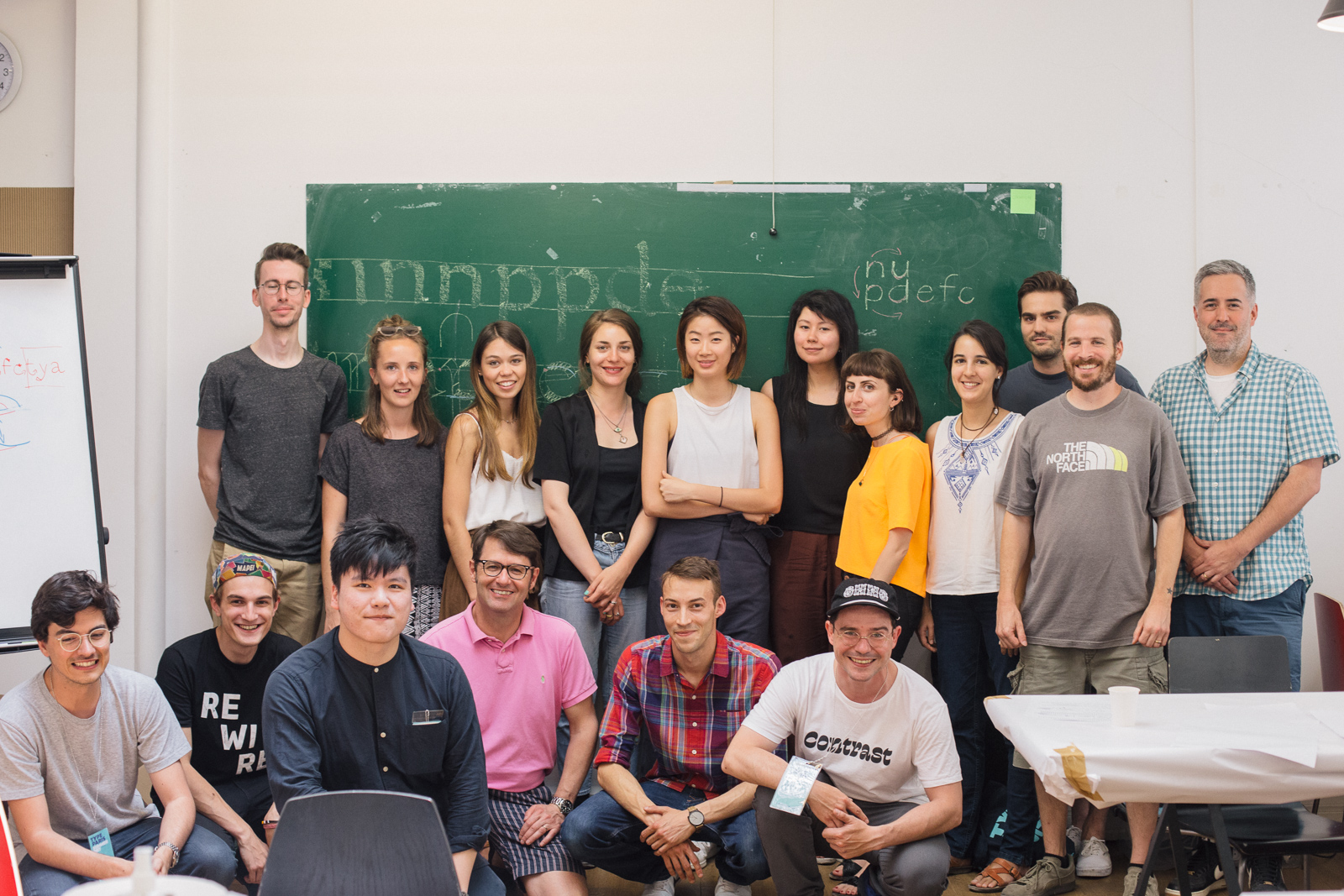
And just like that, TypeParis 2017 has begun! On Monday 19th June, the new attendees arrived at ECV to meet their primary instructors for the course, Jean François Porchez, Julien Priez, and later, Mathieu Réguer. They received their swag bags, name tags, and quickly greeted one another before diving into the first day’s content.
Later in the week, we visited the Bibliothèque Mazarine and the Bibliothèque nationale de France. In addition to the attendees activities, we heard François Morel & Marina Chaccur’s talks at Le Tank on 20th June 2017.
The first week of the course centred around calligraphy. The attendees learnt first-hand about the letter shapes that emerge when writing with a physical tool, and how these shapes relate back to type design. During their workshops with Julien, the class was taught basic calligraphic curves and lines, keeping their hand steady, and using subtle changes in pressure to create contrast.
These then progressed into letterforms, and various tools were used, held in various ways, to create interesting and useful variations in style. Special attention was also paid to important concepts like spacing, axis, contrast, x-height and more.
“The attendees learnt first-hand about the letter shapes that emerge when writing with a physical tool, and how these shapes relate back to type design.”
Mathieu and Julien continued working with the students on Monday afternoon, progressing the calligraphy to begin thinking in type design terms. Tracing paper was placed over the top of the original drawings, and a new shape drawn; based on the original yet with the full alphabet in mind, the language of the shapes, and the voice the class wanted to give their design.
Tuesdays are set to be big days! The group is graced with a visit from one of our international guests, and in the evening they enjoy TypeParis Talks, held at Le Tank, a co-working space in Bastille, Paris. The first international guest, the wonderful Marina Chaccur, worked with the attendees on a variation on TypeCooker exercises, customised to suit lettering.
A myriad of fun and challenging parameters were laid out, including reverse contrast, backslant, script, no curved/straight lines, long/short ascenders/descenders and more. Rulers and erasers were off limits in favour of creating many iterations to get to a final inked result by the end of the day. The attendees’ output was fantastic, and everyone showed a huge level of growth even from the beginning of the day.
“The first international guest, the wonderful Marina Chaccur, worked with the attendees on a variation on TypeCooker exercises, customised to suit lettering.”
François Morel + Marina Chaccur talks
In the evening everyone headed over to Le Tank for the first instalment of #tptalks17! It was a fantastic evening. We piled into Le Tank, fans and air conditioners blazing, excited to be catching up and to listen to what the speakers had to say.
François Morel was up first, and he took us through his many and varied stages of work, starting from his early days as a graffiti artist, through his work designing album artwork for local rap artists, to his arrival at the fascinating discipline of sign painting. His body of work is impressive, and it was a treat to be taken through his journey.

We broke for some food and drinks and merriment. A lot of us hadn’t seen each other for a whole year, so it was great to find familiar (and new!) faces, and chat about the many things that had been happening over the last 12 months.
We were then treated to a wonderful presentation by Marina. I enjoyed being invited to delve into her passion for patterns, and hearing more of her story. As someone who enjoys dabbling in various disciplines, this quote from Marina was particularly encouraging:
“My grandpa used to say that if u do many things at the same time you don't do them well, but I disagree” @mchaccur #tptalks17
— Andrea Rodriguez (@AndreaCataRo) June 20, 2017
Click here to read more about the TypeParis Talks, and watch the videos of the talks themselves.
Wednesday was an exciting day, as Indra Kupferschmid visited the class, and together with Jean François, started to chat to the attendees about the brief for their typeface project. They were encouraged not to merely choose a genre or shape that they like, but to look deeper, ask questions, such as:
– In which language will this typeface most often be set?
– Different languages impose different challenges on a typeface. I.e. German has more capitals at the beginning of words. In some situations a disconnected c-cedilla is appropriate for French, but less so for others languages, etc.
– What function will this typeface perform? Will it be printed on a newspaper? Scrolling along an LCD panel with coarse resolution? Printed on signs in a large city? Set on top of images in a magazine? Wrapped around a bottle of soft drink at a tiny point size?
– What is the client? Are they in the fashion industry? Is it a brand marketed to children? Is it a bank? A nightclub?
– What is the content? Is it long- or short-form? What mood should the text set? Elegance, approachability, opulence, trustworthiness. Does the style of the typeface fit the style of the content?
The afternoon was spent continuing to work on the humanist designs, and inking and refining more letters. Mathieu also introduced the group to the finer points of capitals; their relationship with the lowercase, tips for scaling stems widths and choosing cap heights.
Thursday began with a super fun and creative workshop with Julien. The class we armed with brushes (a new and more unpredictable tool than the wood piece!), and Julien guided them through a wide variety of exercises, changing up the contrast, width, weight, composition, even restricting the attendees to using only their hands (no fingers), and drawing with their eyes closed. Lots of fun, and the results were great.
“Julien armed the class with brushes—a new and more unpredictable tool than the wood piece they had been using!”
In the afternoon everyone gathered together and they all looked over their work as a group and got feedback from Jean François & Julien.
Bibliothèque Mazarine
At the end of class on Thursday, the group left for their first excursion together, to Bibliothèque Mazarine; the oldest public library in France.
It was a wonderful experience to walk through the naturally cool halls of L’Institut de France, inspecting the letterforms carved in stone, and the intricate marble sculptures. After this we crossed the courtyard to enter Bibliothèque Mazarine. It’s a beautiful place, and home to countless precious and rare books. We spent the afternoon poring through volumes containing stunning examples of workmanship, and dedication to craft. Calligraphy, type, etched illustration and hand-scrawled notes in margins were all inspected closely, and many photographs taken, to serve as inspiration for the attendees’ own projects.
Afterwards, the group gathered a nearby cafe, and chatted and laughed together.
Trip to the Bibliothèque nationale de France
Friday was a little more relaxed, with no class time, instead getting outside in the fresh air and meeting at Bibliothèque nationale de France. We filed quietly in, and continued our exploration through a collection of old books, containing many rare and beautiful type specimens.
After this, the students visited the ‘Bibliothèque Typofonderie’, the generously-stocked library of Jean François himself. The wide variety of books and specimens available there served as excellent fodder to assist the group as they close in on the brief for their personal typeface project.

A nice ending to a busy and exciting week.
– Interview by Dave Coleman.
Learn more about TypeParis courses and conferences!
➼ Reports
➼ Type & graphic designers interviews
➼ Attendees feedback series
Apply to TypeParis Summer course!
The deadline for applications is 14 March, every year.
SPONSORS


