Adage
Adage. What does it mean? In French, it’s a classic dance choregraphy. In TypeParis programme, it’s the name of my first typeface :) Adage is then, related to ballet, and made for the Opéra Garnier. It’s inspired by the contrast between the rigor and fluidity of classical dance. Elegance and contrast are the key words.
After many tries with calligraphy, I was not happy with my tests, so decided to take Fournier ’s typeface as a reference. It matched perfectly with the period, and the italic inspired me for the idea of movement.
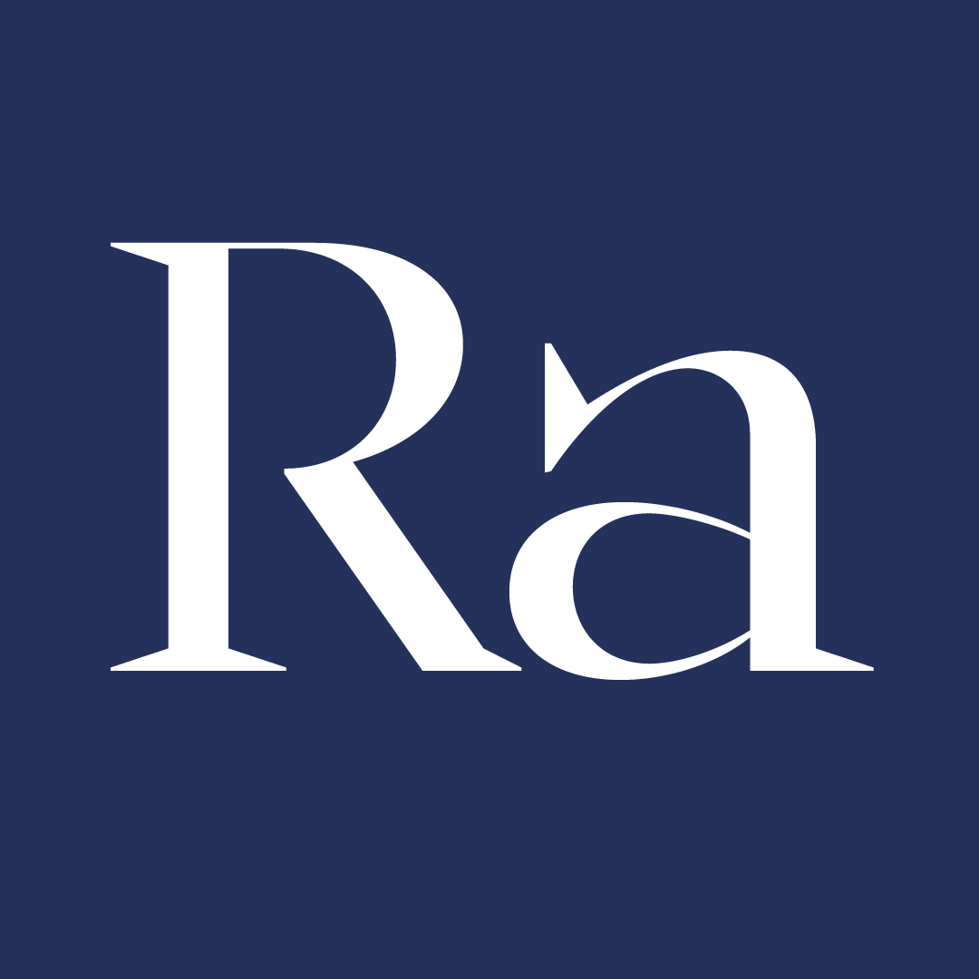
Finally, I ended up with the Adage Light as my main typeface. The stem of the letter is thin, the connexion between the stem and the other part of the letter is even thiner (for the contrast) and the serifs are pointy (for the rigor and elegance).
The second step was to create the black version of my typeface and it was the most difficult part! I didn't know I could develop such hatred for a letter :’) The g lowercase was a nightmare! But hopefully, Mathieu came to help me fix my terrible glyph!
The exploration for the display typeface was really fun. I decided to keep my high-reverse contrast letters, because it fit really well with the brief and my main typeface. It still needs some fixes but I am happy with the shapes it creates.
Finally, the last step was to build the italic. It was my favorite part, because I could draw the swashes I wanted to do since the beginning of the project. I am very happy with the result. We can feel the idea of movement through them.
My type family is now composed by a roman (5 weights), an italic and a display version. I am happy with the result, and it was not so obvious at the beginning of the programme. Indeed, I discovered I was the youngest and it scared me a little bit because I was a complete beginner compared to the others… But I am really proud of what I’ve accomplished during these 6 weeks :) I could never imagine learning so much and so fast!
Talking about people, the Type22 group was so nice ! We quickly became very good friends. I am so grateful to have spent this time with kind, generous and smily people. Of course, thank you Jean-François, Gina, Mathieu, Julie, Malou, Marc, Reiner, and all the type critics, who were so nice to us and made us progress really really fast ! This was a great opportunity for me, as a student to learn so much, so early in my graphic design journey! So thank you :)


The 6-week type design programme that you’ve been waiting for starts on 4 June and ends 12 July 2024.


Our summer programme is in English and covers typeface design and calligraphy techniques, type history, and software practices. Every kind of design professional can learn about type design in a relatively short amount of time.
➼ Subscribe to our mailing list to stay informed.